From Pop + Optical Art to the Rejection of the Artistic Object – the 1960’s.

by Asia Leonardi for the Carl Kruse Arts Blog

It will be inevitable, in this article, to feel a certain sense of unease and difficulty in orienting oneself in front of works that are very different from each other a few years later. You will find all and the opposite of everything. In the past it was easier when faced with a painting, a sculpture, an architecture, to establish the period, to propose a probable dating, because the spirit of the time (what marks an age in itself and determines a taste) resisted longer, it stretched out, without encountering serious obstacles, for decades. Yet the speed of societal and cultural change is reflected in the speed and change in art. The spirit of the times today has certainly not ceased to act; but its range of action no longer differs over decades but over every handful of years, because the changes are more rapid than in the past.

From the end of the fifties the reaction to the informal, to its desecrating and nihilistic fury, passed through different experiences, somehow opposed, such as Optical Art” and Pop Art”. Optical art (mostly known with its abbreviated term op art) includes those artistic manifestations interested in the analysis of perceptual and kinetic phenomena. In this context, the artists created, on the one hand, works with their own movement, on the other works that, thanks to a study of perceptual tricks, create different visual effects according to the movements of the viewer, thus soliciting his participation.

Carl Kruse Art Blog - Victor Vasarely

Victor Vasarely; Op Art


With these interests, op artists grafted an aversion to any romantic individualism into a line of research connected with the rigorous scientific spirit through groups such as the German Group Zero, the Swiss Kalte Kunst, the French Group de Recherche d’Art Visuel, the Yugoslavian Nove Tendencije.

In the context of op and kinetic art, the production of multiple works designed by the artist but made according to industrial procedures in smaller series of copies, often numbered and signed, began. The artist’s intervention is limited to the design phase: one understands how the multiple is placed side by side and often confused with industrial design, and how it also risks lending itself easily to commercial operations and mystifications.

With the so-called pop art (short for popular art) the artist’s interest turned to the world of consumerism, to the Babelic profusion of objects imposed on a daily basis by the system of production and advertising: it’s therefore obvious that this trend would mainly develop in the United States. By isolating the product of daily use, decontextualizing it, transforming it into an idol, a totem, a fetish, pop art alluded to the depersonalization of a world dominated by the profit of things, and ironically celebrated the triumph of goods and launched a cry of alarm. 

Artists such as Robert Raushenberg, Jasper Johns, Claes Oldenburg, Jim Dine, Andy Warhol, Roy Lichtenstein demonstrated their discomfort by reproducing the most usual objects or images favored by the mass media, sometimes with meticulous, hyper-realistic technique, or by remaking them in natural or hyperbolic dimensions, or by using the objects themselves. In 1964 the pop artists were presented, with great success, in the U.S. pavilion of the Venice Biennale: it was the decisive push for the start of a short but intense pop season throughout Europe.

The second half of the sixties, in the whirlwind succession of fashions, saw the affirmation of minimal art (sometimes labeled “Primary Structures”, from the title of a 1966 New York exhibition), not without ties to pop art. The term “minimal” refers to the fact that artists of this trend minimize the complications of form, and aspire to elementary forms using simple and non-traditional materials (concrete, iron, steel, wood, aluminum, plexiglas, etc). This is how often large-scale works of geometric evidence are born,consisting of isolated or repeated modules, with the intention of involving the surrounding space in some way.

Carl Kruse Art Blog - Primary Structures, New York

Primary Structures, exhibition 1966, New York


The artists of minimal art, pugnacious opponents of the com-modifiable object and in search of elementary volumes (almost in an attempt to trace the origin of forms) were already close to conceptualism, a trend (the term was used for the first time by Sol LeWitt in 1967) which, having abandoned any intention of representation, will make reflection on art prevail and will underline the phase of planning over actual realization. But conceptualism is a phenomenon with rather vague outlines and it is really difficult to frame, given that from time to time poor art, land art,visual poetry, those forms of spectacularization of art represented by happenings and performances. Poor art, however, well underlines the predominant trend in the late sixties, namely the rejection of the traditional artistic object.

Carl Kruse Art Blog - Allan Kaprow’s “Happenings”, 1960, New York

Allan Kaprow’s “Happenings”, 1960, New York

One of the reasons that underlie many experiences of recent years has been the anxiety of renewal at all costs (we could also define it as a revival of the spirit of the avantgarde), the rejection of everything that even remotely resembles “already done”. This novelty race combined with a spirit of revolt, distraction, profanation in the sixties and seventies. The artists have reached insurmountable limits: they have applied the label of artistry to practically everything, they have exhibited themselves in the halls of museums, they have even really hurt themselves. The protest against the traditional system of arts has been radical, and often a reaction to the commodification of works; however, we must warn that the market has been able to seize seemingly elusive experiences, by putting into circulation, for example, photographs or recordings of performances, body art events, land art and so on.

Of course, many experiences imbued with such a strong radical spirit have had the merit of demythologizing the aura that surrounded the work of art, but at the same time, a large part of the public has pulled back, unable to understand or even in horror.

In the artistic events after 1945, it must be said, the tools of expression have multiplied, from cinema to video-tapes to electronic instruments and now NFTs, resulting from the most advanced technology, and the artist has seen an increase in her possibilities of manipulation and intervention, able to fully realize demiurgic wishes. Numerous operators were active with very different means: the case of Andy Warhol teaches, with his decisive contribution to the development of underground cinema.

Carl Kruse Art Blog -Andy Warhol, Marilyn Monroe, 1967; New York, collection of Leo Castelli

Andy Warhol, Marilyn Monroe, 1967; New York, collection of Leo Castelli

Andy Warhol’s position is highly critical of mass media-induced distortion. The artist works on sensational images, the faces made famous by the news (Marilyn Monroe, Jacqueline Kennedy), the photographs of a disastrous fire, of a spectacular car accident. The media repeatedly propose the same images to us, manipulate them, deform them, and Warhol thus renders them, almost unrecognizable, insisted on some detail, half-erased for the rest. They are the same fragments of reality that are offered to us every day by newspapers, television, cinema, but which no longer have the power to strike us, they leave us indifferent (and very soon reality itself does not arouse different reactions in us).

============
The blog home page is at https://carlkruse.net
Contact: carl AT carlkruse DOT com
Other articles by Asia Leonardi include those on Frida Kahlo, Charlotte Salomon, More on Action Painting, and Jackson Pollock.

Infinite Worlds Upside Down – The Interior Landscapes of Maurits Cornelis Escher

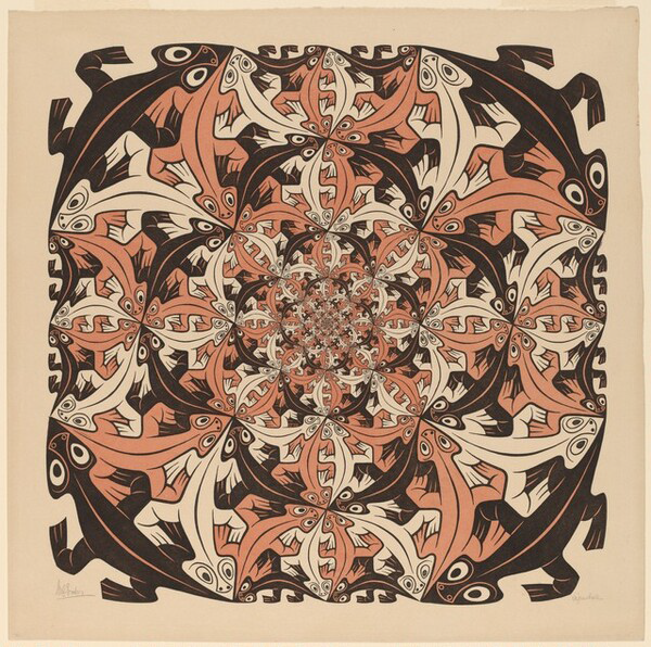
by Asia Leonardi for the Carl Kruse Arts Blog

The graphic art of Maurits Cornelis Escher is different from that of any other artist, instantly recognizable to millions of people around the world, representing an always compelling combination of art and mathematics.

Escher’s world, which explores issues of infinity and paradox, of impossible geometry and perspective distortion, is animated by a playful imagination and the unexpected, crafted with precision and an extraordinary attention to detail.

Born in Leeuwarden, the Netherlands, on June 17, 1898, Escher did not shine particularly well in the early years of school due to health problems, yet, he showed artistic talent and in 1919 he enrolled at the Haarlem School of Architecture and Decorative Arts. He began studying architecture (a subject that would have fascinated him throughout his career) but after a short time, switched to the decorative arts with courses in drawing and wood engraving. Escher left school in 1922 and went on a tour of Spain and Italy that would significantly influence his later works.

During his travels, he met Jetta Umiker, whom he married in 1924, and for the following 11 years, the couple lived in Rome. Escher explored Italy far and wide, creating sketches and drawings, many of which reveal a growing interest in perspective distortion. Later, the artist would take these early elaborations to the extreme, basing his works on “impossible objects,” such as the famous and confusing Necker’s Cube and Penrose’s Triangle.

Under Mussolini’s regime, life in Italy became intolerable and in 1935 the family moved to Switzerland. 1936 was an important year for Escher and saw the transition in his works from natural landscapes to interior landscapes. He also saw the beginning of a lifelong fascination with tessellated shapes, inspired by a visit to the Alhambra. Escher called this new technical elaboration the “Regular Division of the Plane”. In 1937 the prints Still Life and Street and Metamorphosis I already testified to the essence of many of Escher’s new concepts: ambiguity, impossible reality, metamorphosis, altered perspectives, which would become dominant themes for the rest of his career.

After moving to Belgium in 1937, Escher returned to his Nazi-occupied country in 1941, where he would remain until 1970. These were years of great production and inspiration. After the war, the exhibitions earned him international fame and honors, including a knighthood. In the course of his life, Escher made 448 lithographs, woodcuts on wood or heads, and over 2000 sketches. His images bring to life the unreal, the paradox and the incomprehensible, with results that few others have equaled. In 1970 Escher moved to a retirement home for artists where he continued to have a studio. He died on March 27, 1972.

“I always move between puzzles.  Some young people come to me to tell me: yours is Op Art too.  I have no idea what Op Art is.  I’ve been doing this job for 30 years. 

Carl Kruse Art Blog - ESCHER image 1

Smaller and Smaller, 1956 | wood engraving and woodcut in black and red-brown printed from four blocks | 38 x 38 cm

Smaller and Smaller is an extraordinary example of Escher’s “Regular Division of the Plane” and also testifies to the artist’s interest in infinity. The lizards, arranged so that noses and tails coincide, are elegantly arranged in a vortex until they disappear into the infinitely small in the center. The work was created in 1956, the year that marks the moment when Escher began to take a research interest in expressing the infinite with tessellations. His interest was piqued by discussions with the mathematician Harold Coxeter, during which the two studied the possibility of combining the artist’s principle of “Regular Division of the Plane” with Coxeter’s geometric figures.

Escher himself often pointed out that he did not receive a formal education in mathematics, however, in works such as Smaller and Smaller and others, he achieved perfect accuracy within complex geometric theories. As Coxeter reiterated in 1995 “Escher is absolutely accurate, down to the millimeter.”

“Only those who measure themselves against the absurtd will achieve the impossible.  I believe it’s in my basement..Now I go up and check.

Carl Kruse Art Blog - Escher image 2

Other World (Another World), 1947 | wood engraving and woodcut in black, light browning green printed from three blocks | 31,5 x 26 cm

 Other World, also known as Another World, the first of Escher’s prints to explore his idea of relativity, is a study of the relationship between objects. The artist presents to the viewer a structure with five open walls, with almost identical Romanesque arches that offer a view on a series of different panoramas. The two arches at the base present an upward perspective on space, the two upper ones look down on a lunar landscape and the two in the center on a lunar horizon. The image, therefore, creates a paradox: each floor could be both the zenith and the nadir of the structure, so everything is relative depending on where you look. The image also features a bird with a human face perched on three arches, while a horn hangs from three other arches. The bird is the representation of a small sculpture donated to Escher by his father-in-law, and is present in several works by the artist.

“Are you really sure that a floor cannot be also a ceiling?”

Carl Kruse Art Blog - Escher Image 3

Bond of Union, 1956 | lithograph 26 x 34 cm

The heads of a man and a woman float in the darkness and are formed by a single spiral ribbon that also joins them for the forehead.  Infinite space-time is suggested by the spheres, similar to small planets, suspended in front, behind and inside the heads. Bond of Union is one of Escher’s most representative works and was inspired by the reading of “The Invisible Man”, the novel by H. G. Wells in which the hero has his head wrapped in bandages.

In this work, once again, the image expresses the artist’s exploration of the infinite. Moreover — an uncommon aspect of Escher, more interested in paradox, geometry and unreality than in “human” issues — he recalls the myth of Adam and Eve, and the bonds that keep men, women, and all humanity together. In this sense it is one of Escher’s most touching and most surprising works.

“The things I want to express are so beautiful and pure.”  

===========================

Carl Kruse Art Blog Homepage is here.
Contact: carl AT carlkruse DOT com
Also by Asia Leonardi: The Photography of Francesca Woodman, Jackson Pollock’s Hymn To Freedom.
The official Escher website: https://mcescher.com/
Find Carl Kruse on Hackernoon.