Steve McCurry: Vulnerability Made Immortal


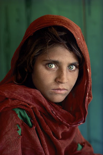
By Asia Leonardi for the Carl Kruse Arts Blog

Member of the Magnum, Steve McCurry graduated in 1974 in Cinematography and Theater from the University of Pennsylvania. He began work as a freelance photographer in the late 1970s, dispatching reports from India and Afghanistan, the countries with which his work is most identified. The turning point in his career happened in 1979, when he entered the Afghan areas controlled by the Mujahideen, shortly before the Russian invasion. He returned, crossing the border with rolls of film sewn between his clothes.
His color images, which combined the art of reporting, travel photography, and social investigation, have been published in countless publications, but Steve McCurry’s name remains particularly attached to National Geographic, of which he made the most famous cover of all time. (As an aside, and now sadly defunct, Carl Kruse was active on National Geographic’s “YOUR SHOT” for several years).

Carl Kruse Art Blog - Steve McCurry

There is a paradox in Steve McCurry’s photography. On a technical level his photos are
practically perfect, serene, characterized by the strength and liveliness of color, but they tell
disturbing stories of poverty and uprooting, hunger, and desperation. It might seem perhaps a lack of empathy with the photographed subjects, but in
reality, it is the opposite. His images are the result of
scrupulous research, made through long journeys
and exhausting waits for the perfect moment. So he tells how he managed to take the famous
photo in which he portrays Sri Lankan fishermen balancing on bamboo rods: “First I studied the
places and fishing techniques, then I found the right place and a point of view convincing and before shooting I went back three times: in the late afternoon, early in the morning and after sunset. In the end, I chose the light of 7 when the sky is completely covered .”

McCurry’s approach is mainly anthropological, culture, religion,
and traditions are present in his images. McCurry does not seek the dazzling and explicit shot, his photographs tell the events by placing them in a broad context. As he tells the Italian journalist Mario Calabresi, to be a photagrapher you have to “immerse yourself” in the reality you want to represent. This is how he recounts his experience during the monsoons in India, during which he made a reportage that would have given him world fame: “That year I understood that to succeed, I had to enter in the filthy water, covered with mud, full of waste and dead animals: to fulfill my project, I had to accept all
risks, including that of getting sick and dying.”

Carl Kruse Art Blog - Steve McCurry - 2

As is clear from his photos, Steve McCurry pays attention to the human being: “Most of my photos are rooted in people. I look for the moment when the most genuine soul appears, in which the experience impresses on a person’s face. I try to convey what a cultured person can be in a wider context that we could call the human condition. I want to convey the visceral sense of beauty and wonder that I found in front of me, during my travels when the surprise of being a stranger mixes with the joy of familiarity .”

Carl Kruse Art Blog - Steve McCurry- 3

The American photographer was one of the first to describe India and Asia using color photography. Before him, the subcontinent had been told practically only in black and white. Mccurry’s India, on the other hand, is composed of an infinite variety of bright and contrasting visions, smells, and flavors to which only color can do justice. This also gives rise to some criticisms, especially from those who believe that black and white unquestionably has a ” depth ” and “substance” that color photography will never be able to reach. But one of the characteristics of great photographers is that they know how to go beyond the limits of a medium and in doing so create a new standard.

Steve McCurry, undoubtedly, has this characteristic and his photography is universally appreciated for its beauty and humanity.

===========

The Carl Kruse Art Blog home page is at https://carlkruse.net
Contact: carl AT carlkruse DOT com
Other posts on great photographers in the blog here and over here
Carl Kruse is also on Dwell, taking in their beautiful images of design and architecture.

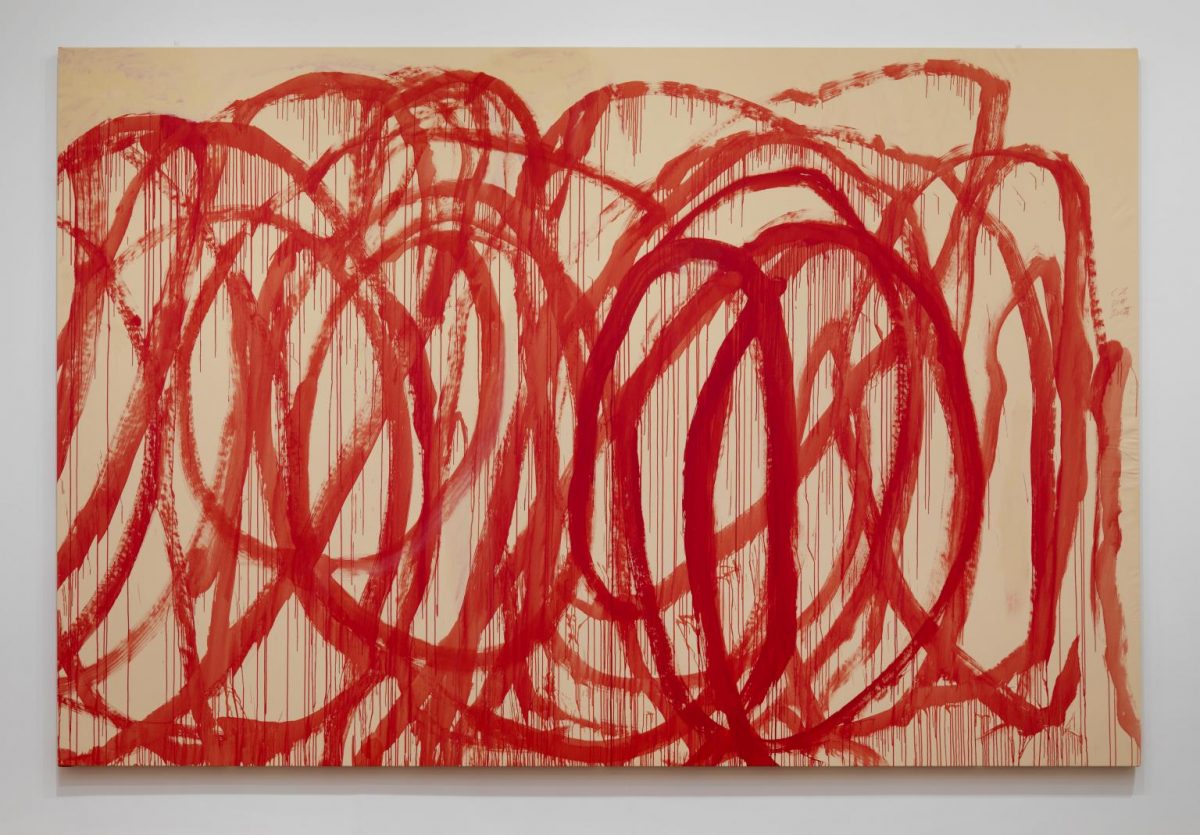
More on Action Painting

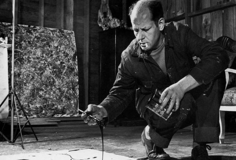
One of our readers wanted more on action painting, the technique highlighted in our previous post on Jackson Pollock, and our resident writer Asia Leonardi — who wrote the original Pollock piece — was happy to oblige with a quick survey. Take it away Asia!

Action painting
is as an immediate, free, spontaneous painting in which the entire body of the artist is involved in the creation of the work, whose execution is entrusted to the gesture of the arm; a painting made with splashes, stains, dripping from the brush or directly from the can on the canvas’ surface, which is often placed in a horizontal position.

Carl Kruse Art Blog - Jackson Pollock at work

Jackson Pollock at Work

The resulting signs form a chaotic image, an irrational and informal intertwining of colors and lines, the result of a casual gesture that wants to bring the surface the hidden motivations of the unconscious, thus linking itself to contemporary philosophical positions of an existentialist matrix.

Carl Kruse Art Blog- Action Painting Team Event

Action Painting. Team Event, Kitzbühl

The work of art becomes the expression of an exasperated subjectivism, of the automatic action of the unconscious, the canvas is the means and intermediary between the material, the color, the sign and the artist’s unconscious, at the point that Jackson Pollock writes “When I paint I don’t have the exact perception of what is happening, only after I finish I realize what I have done…”

Carl Kruse Art blog - Jackson Pollock Number 1A

Jackson Pollock, Number 1A, 1948

Action painting is the expression of a state of mind, the burst of a charge of energy, the explosion of an inner drive that does not express itself according to a predetermined project but almost automatically follows an uncontrollable impulse of the deep, with obvious references, albeit with completely different formal outcomes, to Expressionism, for the violence of language, to Dadaism, for the charge of rebellion, to Tachisme, for what concern the technical aspect (in spots), but especially to Surrealism.

Like Surrealism, action painting enhances the supremacy of the unconscious, the automatic value of the result, which does not depend on conscious formal or conceptual choices but is the result of pure gestures of a psychic automatism that freely outlines form and content, And irrationally, it does not want to explain, only to express.

Carl Kruse Art Blog - Franz Kline - Meryon - 1961

Franz Kline, Meryon, 1961

This cultural current gathers artistic personalities that are also very different from each other, united by a widespread sense of anguish and discomfort for the horrors of war, a manifestation of the degeneration of the myth of rational modernity, united in a general attitude of reaction that leads them to withdraw into the unconscious, looking for themselves, their anxieties and the unfathomed depths of their psyche: the result of this inner descent will produce, depending on the artist’s personality, works full of violent desperation, or even of restlessness and meditation. Consecrated as the greatest representative of action painting and abstract expressionism, Jackson Pollock represented an important moment in the artistic research of the last century, especially for American culture, contributing significantly to the affirmation of the United States as a new center of art in the second half of the 20th century.

==============

Carl Kruse Art Homepage.


Contact: carl AT carlkruse DOT com.

There is a great article on Action Painting over at Widewalls, including a how to video to paint like Jackson Pollock.

When did we Stop Criticizing Art?

by Hazel Anna Rogers for the Carl Kruse Arts Blog

When I was around 13, I visited the Tate Gallery at the Liverpool Docks in Northern England primarily to see an exhibition of J.M.W. Turner and Cy Twombly, a starkly contrasting set of artists and the latter of which I actually had next-to-no prior knowledge of. Turner’s tableaux were mesmerizing, a sheer cacophony of violent maritime depictions in furious reds and oranges juxtaposed to ominous grey skylines. The walls of the gallery were filled with gloriously calm sunsets at sea alongside terrifying raging flames and waves that curved and swayed and spat like sharks feasting on shoals of fish. It was wonderful, an utterly overwhelming delight for the senses.

Carl Kruse Blog - Painting by JMW Turner


Fishermen At Sea,” J.M.W. Turner (1796) – Image courtesy Tate Gallery

In the next room on I was suddenly surrounded by Cy Twombly’s enormous canvases. Scrawls of paint had been twirled and splatted and daubed onto the huge white expanses creating a graffiti-like effect, some with the appearance of words. I hated it. It felt all wrong, an expression of seeming carelessness towards the production of his masterpieces. After having wandered dreamily through Turner’s paintings, this felt like a punch in the eyes, a pointlessly unartistic exposition in the name of ‘art’. Yet, I felt unable to say anything against those huge, grotesque paintings, being observed as they were by a silent audience of respectful spectators.

Carl Kruse Blog - Twombly

“Untitled (Bacchus),” Cy Twombly (2008) – Image courtesy of Tate Gallery

I understand the differences in artistry and approach to creation much more now than I did at 13. I understand that the process of creating a masterpiece is not prescriptive, nor is it defined by one particular artistic style. I also understand that the emotions I felt, being surrounded by Twombly’s scribbles, were valid sentiments, and likely would have pleased Twombly himself should I have recounted them to him. But that doesn’t discount my anger, my frustration that art with no merit except its colossal size and thus imposing presence should be beside the tender daubs of someone like Turner. The art world has always had opposing views on what is, or is not, art, but that’s not what I’m talking about here. I don’t disagree that Twombly’s paintings are art. I also don’t wish to debate what ‘beauty’ is with regards to art, as it isn’t always relevant. A piece of art can be incredible without being beautiful. I just want to understand how it is we came to the art world of today, of the 21st Century, where we no longer criticise art.

I am in a generation bewitched by social media, a generation that is unashamedly narcissistic and that relishes self-importance. It is also the generation that produced the Instagram poet Rupi Kaur, along with her pages of simplistic, immature poetry. I have been to slam poetry contests where the winner was crowned not for poetic merit, but for loudly proclaiming how much hardship they had endured through their life. If I sound embittered, it’s because I am. Bygone eras are much the talk of mine and past generations, times when music was exciting, when people wrote letters, when people read books and wrote ones just as wonderful. I often think about the jazz scene of 1920’s Harlem, a sea of exciting talent emerging from an ever-increasing black population, with such greats as Fats Waller and Willie The Lion Smith striking piano keys in the jazz clubs that popped up left right and centre as New York became the epicentre of jazz in the 1930s. It’s that feeling of ‘You had to be there’. I have no doubt in my mind that the musicians playing in Harlem in the 1920s were often showered with tomatoes, booed off-stage, and not invited back until they were better in their respective trades. To be criticised is to be encouraged, to have the drive to get better, to show how good you can really be if you put your mind to something.

Part of the problem with new art is its audience. We can no longer heckle bad poets and bad musicians, or tell people that their paintings are unimaginative or uninspiring. We live, strangely, in a social climate that tells us we need ‘trigger warnings’ for certain books we read, while we watch poets read lines that shout about how they were bullied, raped, oppressed, and harassed without a metaphor in sight to disguise their meanings. And we sit, stony-faced, silent, and clap them, congratulate them on how brave they are to tell us all how much we should pity them. Art is no longer questioned, at least not within the younger generations that I am often amongst.

I remember when I was 15 and won the Young Poet Laureateship for the region where I grew up. Time and time again I would write poems, and time and time again my family would tell me they needed improving, or that they weren’t good at all. Criticism was a wonderful thing for me. It allowed me to grow as an artist, to shape my language into something subtle, sharp and resonant. I was better for it, a more rounded poet and writer, and never once did I resent feedback on my writing, be it bad, or worse, dismissive.

In a world obsessed with art but unable to distinguish the good from the purely egotistical, we find ourselves stranded. I still fell as though I am in that gallery, looking at Twombly’s artwork, perplexed and unimpressed. We discussed the paintings when we went back to school. Twombly’s paintings were ‘experimental’, ‘disturbing’, ‘interesting’, and ‘thought-provoking’. The space to say how much I hated them disappeared quickly as an overriding sentiment of respect for Twombly’s art overtook the classroom. Was it because it was in a gallery, thus it had to be worthy of our awe and wonder? I can’t say. But I think back on that day where I remained silent, and I also think about what would have happened if my family had praised my poetry when they in fact thought it flawed, meaningless and dull. And I will toast to the day that I have the courage to stand up and tell a bad poet what I really think of them, when I have the courage to tell my friend that her indie alternative jazz band needs to get their act together, because all of their music sounds the damn same. I will praise the day that someone tells me they didn’t like my poetry performance, that it was crass or forced or unintelligent, and I will relish the possibility of self-improvement under the motivation of their harsh words. In a world that censors negativity in the face of art, I hope that we can learn to speak our minds once again.

===================

Carl Kruse – Ars Lumen Home Page – Here
Contact: carl AT carlkruse DOT com
Last blog post was on Escher
Another post by Hazel Anna Rogers – Music, Memory, the Cloud
Carl Kruse is also on Pinterest.


Infinite Worlds Upside Down – The Interior Landscapes of Maurits Cornelis Escher

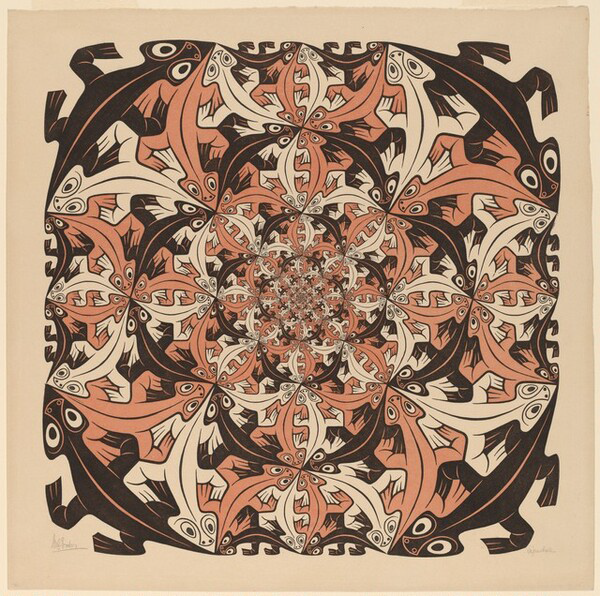
by Asia Leonardi for the Carl Kruse Arts Blog

The graphic art of Maurits Cornelis Escher is different from that of any other artist, instantly recognizable to millions of people around the world, representing an always compelling combination of art and mathematics.

Escher’s world, which explores issues of infinity and paradox, of impossible geometry and perspective distortion, is animated by a playful imagination and the unexpected, crafted with precision and an extraordinary attention to detail.

Born in Leeuwarden, the Netherlands, on June 17, 1898, Escher did not shine particularly well in the early years of school due to health problems, yet, he showed artistic talent and in 1919 he enrolled at the Haarlem School of Architecture and Decorative Arts. He began studying architecture (a subject that would have fascinated him throughout his career) but after a short time, switched to the decorative arts with courses in drawing and wood engraving. Escher left school in 1922 and went on a tour of Spain and Italy that would significantly influence his later works.

During his travels, he met Jetta Umiker, whom he married in 1924, and for the following 11 years, the couple lived in Rome. Escher explored Italy far and wide, creating sketches and drawings, many of which reveal a growing interest in perspective distortion. Later, the artist would take these early elaborations to the extreme, basing his works on “impossible objects,” such as the famous and confusing Necker’s Cube and Penrose’s Triangle.

Under Mussolini’s regime, life in Italy became intolerable and in 1935 the family moved to Switzerland. 1936 was an important year for Escher and saw the transition in his works from natural landscapes to interior landscapes. He also saw the beginning of a lifelong fascination with tessellated shapes, inspired by a visit to the Alhambra. Escher called this new technical elaboration the “Regular Division of the Plane”. In 1937 the prints Still Life and Street and Metamorphosis I already testified to the essence of many of Escher’s new concepts: ambiguity, impossible reality, metamorphosis, altered perspectives, which would become dominant themes for the rest of his career.

After moving to Belgium in 1937, Escher returned to his Nazi-occupied country in 1941, where he would remain until 1970. These were years of great production and inspiration. After the war, the exhibitions earned him international fame and honors, including a knighthood. In the course of his life, Escher made 448 lithographs, woodcuts on wood or heads, and over 2000 sketches. His images bring to life the unreal, the paradox and the incomprehensible, with results that few others have equaled. In 1970 Escher moved to a retirement home for artists where he continued to have a studio. He died on March 27, 1972.

“I always move between puzzles.  Some young people come to me to tell me: yours is Op Art too.  I have no idea what Op Art is.  I’ve been doing this job for 30 years. 

Carl Kruse Art Blog - ESCHER image 1

Smaller and Smaller, 1956 | wood engraving and woodcut in black and red-brown printed from four blocks | 38 x 38 cm

Smaller and Smaller is an extraordinary example of Escher’s “Regular Division of the Plane” and also testifies to the artist’s interest in infinity. The lizards, arranged so that noses and tails coincide, are elegantly arranged in a vortex until they disappear into the infinitely small in the center. The work was created in 1956, the year that marks the moment when Escher began to take a research interest in expressing the infinite with tessellations. His interest was piqued by discussions with the mathematician Harold Coxeter, during which the two studied the possibility of combining the artist’s principle of “Regular Division of the Plane” with Coxeter’s geometric figures.

Escher himself often pointed out that he did not receive a formal education in mathematics, however, in works such as Smaller and Smaller and others, he achieved perfect accuracy within complex geometric theories. As Coxeter reiterated in 1995 “Escher is absolutely accurate, down to the millimeter.”

“Only those who measure themselves against the absurtd will achieve the impossible.  I believe it’s in my basement..Now I go up and check.

Carl Kruse Art Blog - Escher image 2

Other World (Another World), 1947 | wood engraving and woodcut in black, light browning green printed from three blocks | 31,5 x 26 cm

 Other World, also known as Another World, the first of Escher’s prints to explore his idea of relativity, is a study of the relationship between objects. The artist presents to the viewer a structure with five open walls, with almost identical Romanesque arches that offer a view on a series of different panoramas. The two arches at the base present an upward perspective on space, the two upper ones look down on a lunar landscape and the two in the center on a lunar horizon. The image, therefore, creates a paradox: each floor could be both the zenith and the nadir of the structure, so everything is relative depending on where you look. The image also features a bird with a human face perched on three arches, while a horn hangs from three other arches. The bird is the representation of a small sculpture donated to Escher by his father-in-law, and is present in several works by the artist.

“Are you really sure that a floor cannot be also a ceiling?”

Carl Kruse Art Blog - Escher Image 3

Bond of Union, 1956 | lithograph 26 x 34 cm

The heads of a man and a woman float in the darkness and are formed by a single spiral ribbon that also joins them for the forehead.  Infinite space-time is suggested by the spheres, similar to small planets, suspended in front, behind and inside the heads. Bond of Union is one of Escher’s most representative works and was inspired by the reading of “The Invisible Man”, the novel by H. G. Wells in which the hero has his head wrapped in bandages.

In this work, once again, the image expresses the artist’s exploration of the infinite. Moreover — an uncommon aspect of Escher, more interested in paradox, geometry and unreality than in “human” issues — he recalls the myth of Adam and Eve, and the bonds that keep men, women, and all humanity together. In this sense it is one of Escher’s most touching and most surprising works.

“The things I want to express are so beautiful and pure.”  

===========================

Carl Kruse Art Blog Homepage is here.
Contact: carl AT carlkruse DOT com
Also by Asia Leonardi: The Photography of Francesca Woodman, Jackson Pollock’s Hymn To Freedom.
The official Escher website: https://mcescher.com/
Find Carl Kruse on Hackernoon.