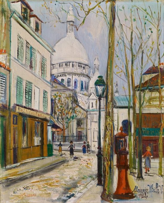
by Hazel Anna Rogers The sun has been shining for some time now. At first, warmth came from behind bulbous grey clouds, yielding a muggy, wet heat, but now light has taken precedence and grass glows white in its piercing rays. We were walking on one such sunny day and stopped beside the book shop
Author: Carl Kruse
Carl Kruse: Human. Being.
The Art of Atari
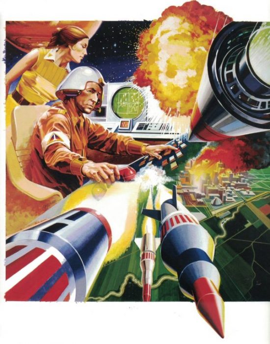
by Fraser Hibbitt for the Carl Kruse Arts Blog Tim Lapetino’s book The Art of Atari is a celebration of the visual worlds that emerged from Atari’s mission to market their video games. It is also a compendium of a certain time, the nascent culture of video gaming. An unavoidably nostalgic book – one flicks
The Legacy of the Satyr
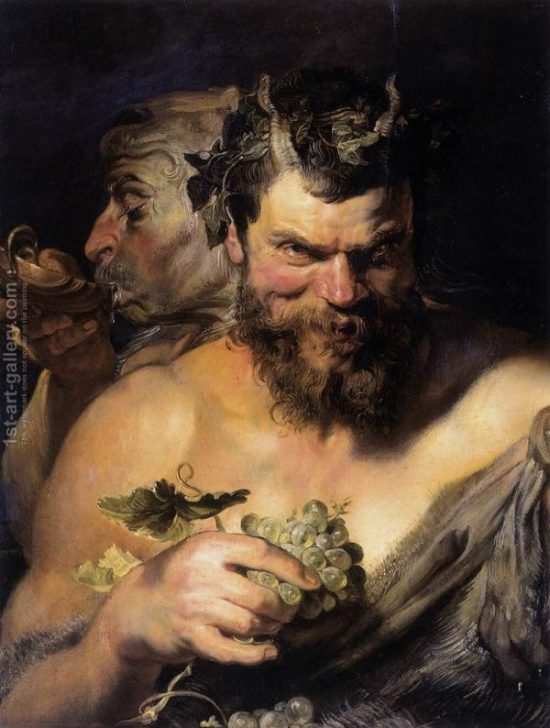
by Hazel Anna Rogers for the Carl Kruse Arts Blog The passing-down of literature fascinates me. I find something utterly awe-inducing in the ability of human language to convey a narrative generation after generation, and for us to have the knowledge and ingenuity to understand the importance of preserving great stories and characters. I suppose
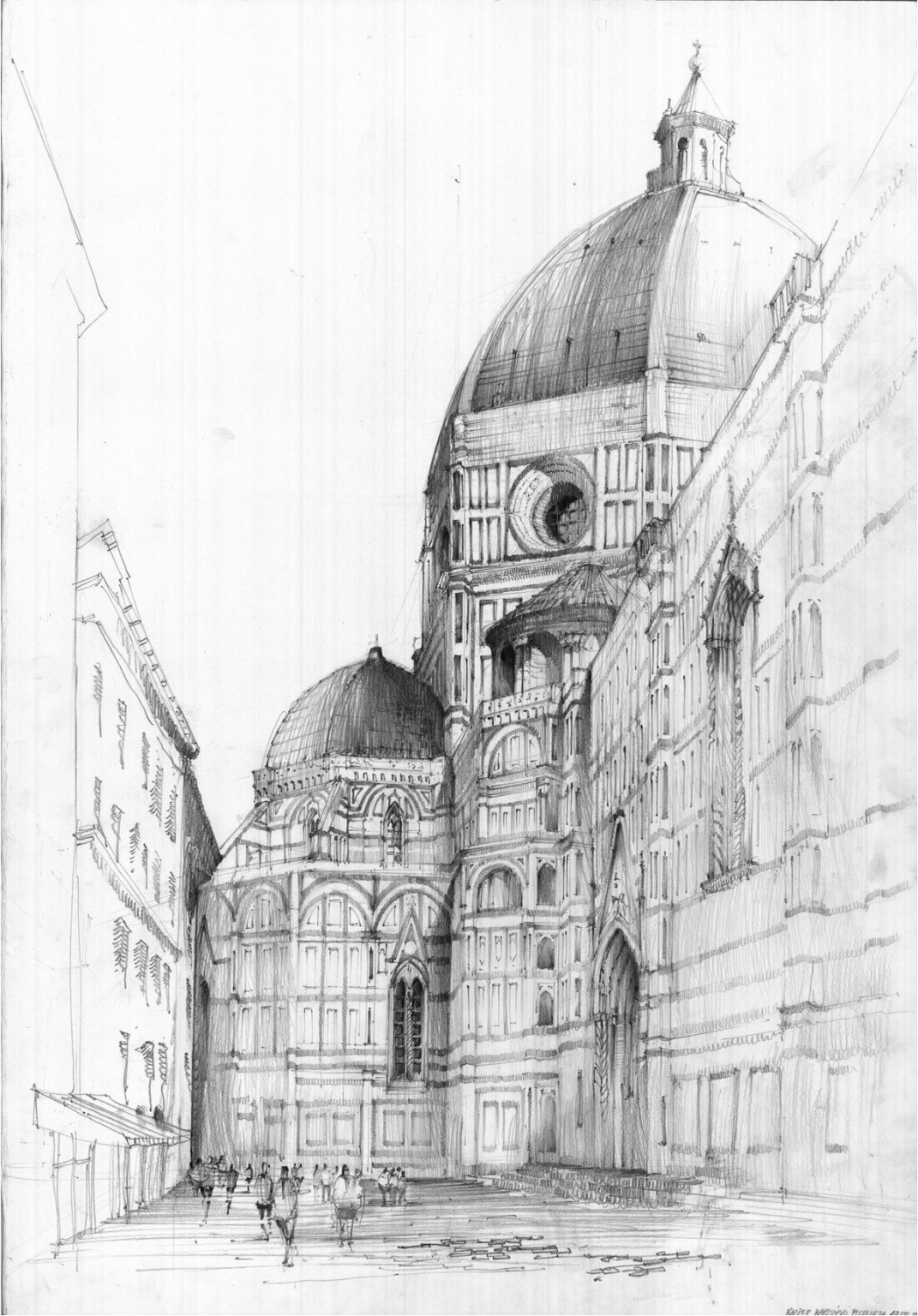
Filippo Brunelleschi and his Dome

By Asia Leonardi for the Carl Kruse Arts Blog Filippo Brunelleschi (1377-1446), architect and engineer, sculptor and painter, is universally considered the pioneer of the Italian Renaissance and the creator of an approach to architecture that would dominate the European art scene, at least until the end of the 19th century. Through a passionate study
Marina Abramović, Grandmother of Performance Art
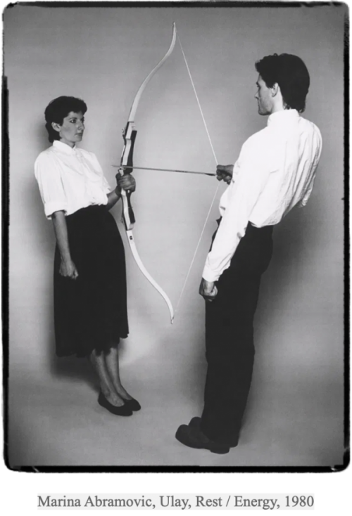
By Asia Leonardi for the Carl Kruse Arts Blog This story begins with a woman standing motionless in a room. Half-naked, a trickle of blood dribbles on her breasts, her eyes swollen with tears, and a gun is aimed at her while surrounded by a group of men. This is not the scene from a crime
From Pop + Optical Art to the Rejection of the Artistic Object – the 1960’s.
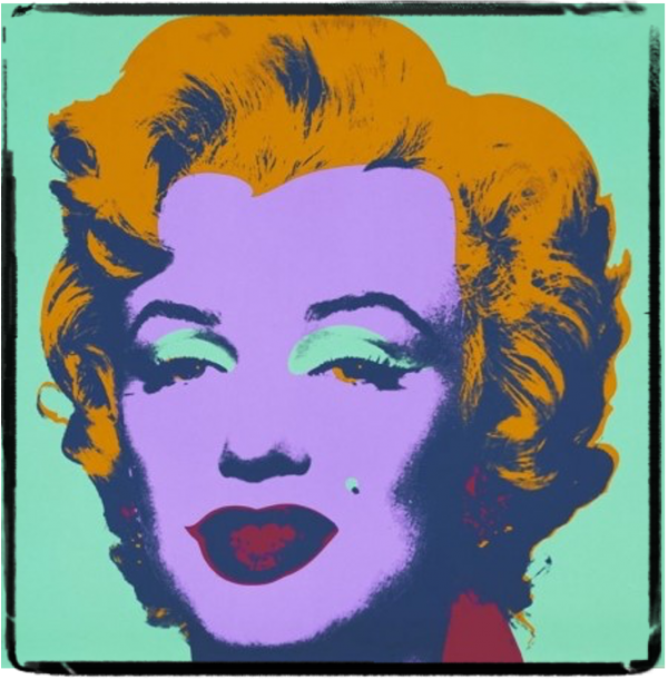
by Asia Leonardi for the Carl Kruse Arts Blog It will be inevitable, in this article, to feel a certain sense of unease and difficulty in orienting oneself in front of works that are very different from each other a few years later. You will find all and the opposite of everything. In the past
Frida Kahlo: Flowers Are Born From Mud
by Asia Leonardi for the Carl Kruse Arts Blog On 6 July 1907 in Mexico City, Magdalena Carmen Frida Kahlo y Calderon was born to German parents who emigrated from Hungary. She claimed to be born in 1910, with the Revolution, with a new Mexico. Frida Kahlo is a revolution. An artistic revolution, a revolution
Are Memes Art?
by Vittorio Compagno for the Carl Kruse Arts Blog The digital era gave birth to unique trends tied to the advent of the Internet. The source of many of these trends is as old as the internet itself, which is to say online forums. From these fountains of discussion, as in the ancient Greek “agorà,”
Thinking About Realism
by Fraser Hibbitt for the Carl Kruse Arts Blog Realism tells tales like any other genre, and it is odd that we should be forced through much digression knowing that point. What I mean when I say Realism is the specific genre of fiction that wishes to imitate contemporary life in a ‘realistic’ manner. Realism
Movements of the Soul Translated into Ceramic: Manon de Vlieger
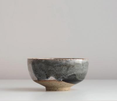
Interview by Asia Leonardi for the Carl Kruse Arts Blog Amsterdam is the motherland of artists. Among its streets, its bridges, and its canals, a century-old history reverberates, interwoven on the concepts of tolerance, resistance to authoritarian domains, spontaneous expression, freedom. It is for this reason that this city offers a combination of the most